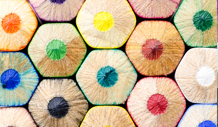
Color trends don’t just apply to the catwalks. They are for home décor and fabric design too. Now the fashion shows in New York, London, Paris and Milan are over, we know what the new season will look like. Here are the hottest colors for this fall and winter, according to the experts at Pantone. They’re a fabulous mixture of strength and charisma with both earthy and vibrant tones represented. Prepare to be inspired.
 1. Riverside – Pantone 17-4028
A classic choice for fall/winter, Riverside is a deep blue color somewhere between navy and cobalt. It’s a deep, enveloping shade – soothing and serious with a captivating air of mystery.

2. Airy Blue – Pantone 14-4122
The blue color family is a major theme for this fall/winter. Airy blue is a light, ethereal tone. Fashion giants like Oscar de la Renta and Dolce & Gabbana embraced this angelic color. Why not use it in your craft projects?
 3. Sharkskin – Pantone 17-3914
Gray tones are always popular for fall/winter and the new season is no exception. Shakskin is a confident, sturdy shade that looks great contrasted with brights.
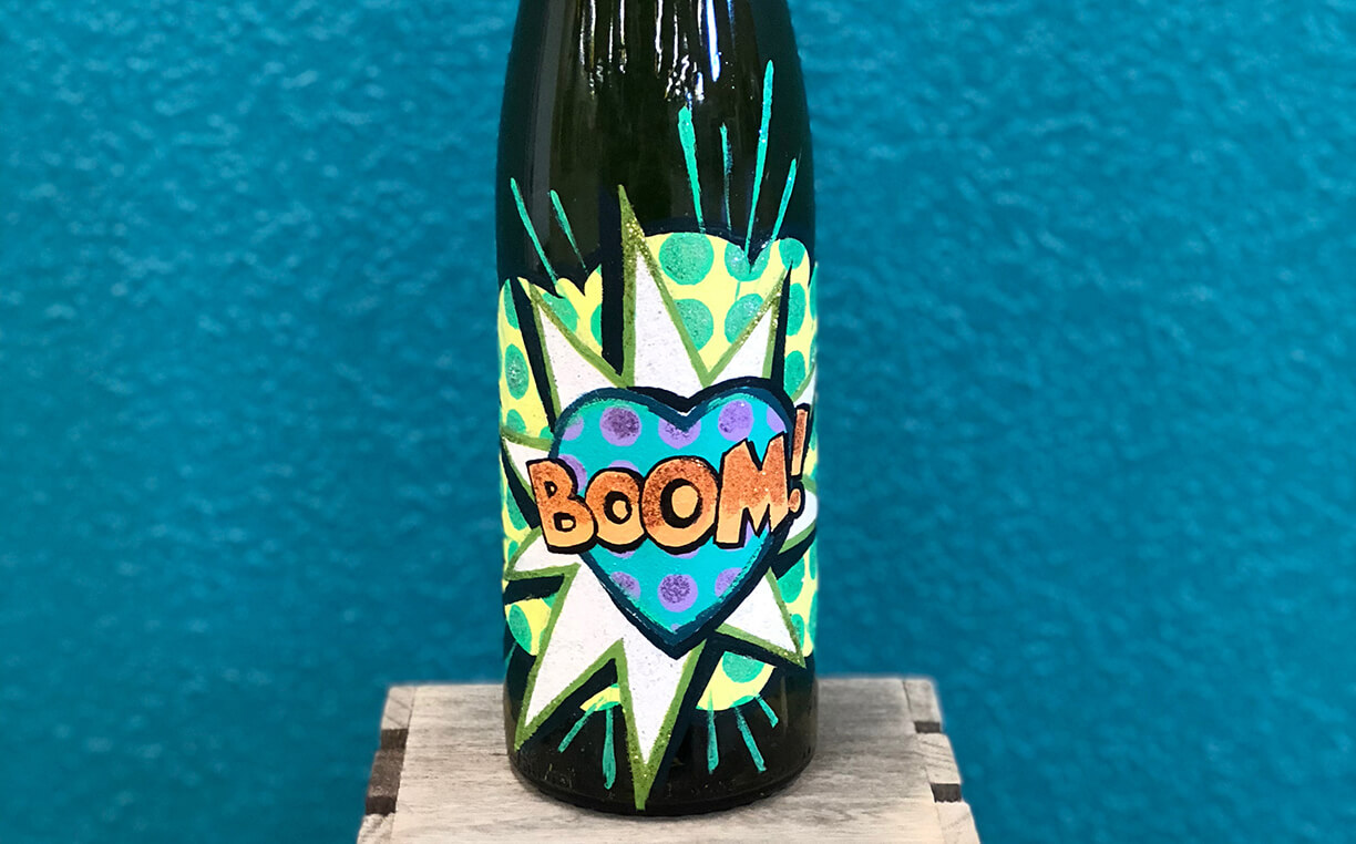
 4. Aurora Red – Pantone 18-1550
Red was a huge trend on the catwalks, from crimson and scarlet to carmine and burgundy. Aurora Red is sensual, decadent and fabulous.
 5. Warm Taupe – Pantone 16-1318
This color is organic and earthy, providing some much-needed stability to this season’s palette. It’s a fantastic choice for homely crafts.
 6. Dusty Cedar – Pantone 18-1630
This is a particularly delicious shade of muted pink. It was big news on the catwalks at Miu Miu and Etro. Now you can make it big news in your next creation.
 7. Lush Meadow – Pantone 18-5845
Be inspired by the endless beauty of nature. This fresh green hue is what it’s all about in the next season.
 8. Spicy Mustard – Pantone 14-0952
Zesty and exotic, Spicy Mustard is a beautiful shade, especially for fall. It really livens up your home décor and craft items.

9. Potter’s Clay – Pantone 18-1340
Somewhere between russet and woody brown is Potter’s Clay. It reminds us of leaves falling from the trees.
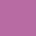 10. Bodacious – Pantone 17-3240
An antidote to the earthier tones on offer is Bodacious, a bold, feminine pink-purple. It gives a touch of sophisticated allure to any item.
If you’d like some further creative inspiration, take a look at our other blog posts.